Whats up with the search button ?
- This topic has 17 replies, 9 voices, and was last updated 5 years, 9 months ago by .
- You must be logged in to reply to this topic.
HOME › Forums › The FUNKYTIME Website › Bugs › Whats up with the search button ?
Whats up with the search button ?
Looks like a bug on the funkytime.tv/members/USERNAME/forums/replies/ pages!
um… that’s a long boi
Sam likes them long
I see, I see…
I think the real question is what in the world is up with that long chain of comments @lewise XD
Its a comment log….
Ah okay. That makes sense. I couldn’t really tell what I was looking at.
I was about to say that lol
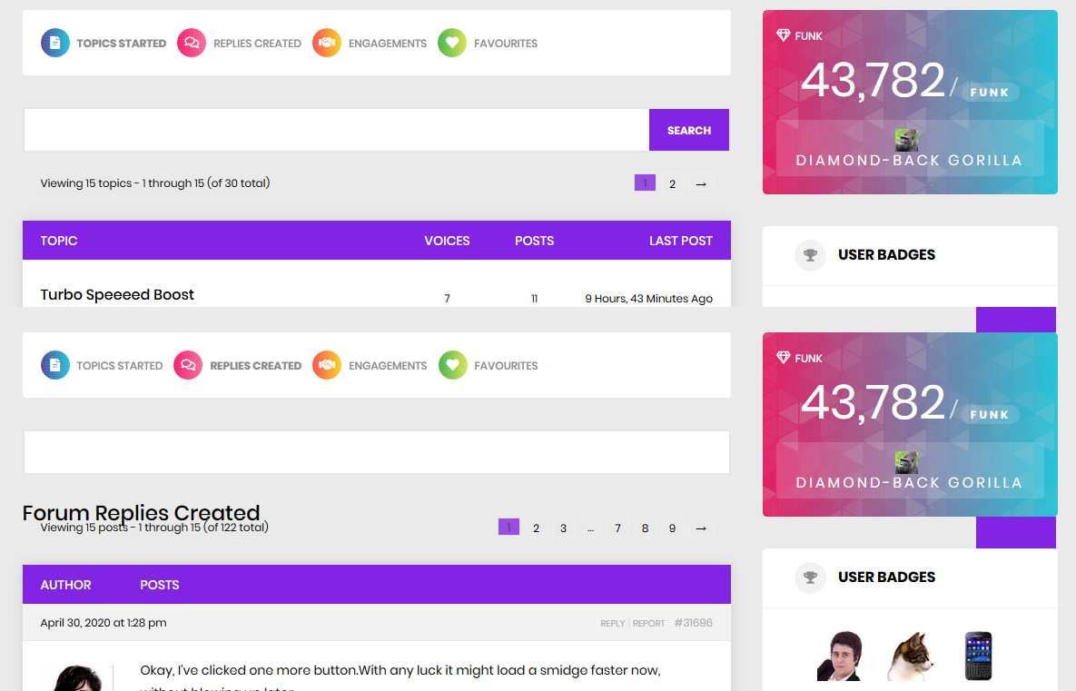
If you go to any profile go to activity then replies, the seach box just went to the side a little bit, and all the way down to the bottom of the website
the image at the top is just the activity part the one at the bottom is replies
Just a screenshot of the entire website to show that it goes all the way to the bottom
Edit: the website really lowered the resolution on this, but you can still see long search box. And in the middle it says search. which is about 3 pixels on this image

Thanks @Kalle69. I’ve merged your topic with the existing one, the POPE is aware of this bug.
It’s not the size of the search button; it’s what you can do with it.
ahh, the pope has spoken

The search button on the activity page is really tall